Typography for Bilingual Websites in Hong Kong
Master the art of pairing Latin and Chinese characters. Create harmonious, readable designs for mixed-language content on high-density displays.


Why Typography Matters in Hong Kong
Hong Kong’s bilingual landscape presents unique typographic challenges. English and Chinese scripts have fundamentally different proportions, weights, and visual characteristics. Getting this right isn’t just about aesthetics — it’s about readability and user experience. When typography is poorly handled, readers struggle. When it’s done well, content flows naturally across languages.
We’ve spent years studying how Latin characters work alongside CJK scripts on high-density displays. From font selection to line spacing to hierarchy, every decision impacts how your message lands. This guide breaks down the essentials so you can create bilingual websites that actually work.
Learn Our ApproachCore Typography Principles
Master these fundamentals for bilingual design success
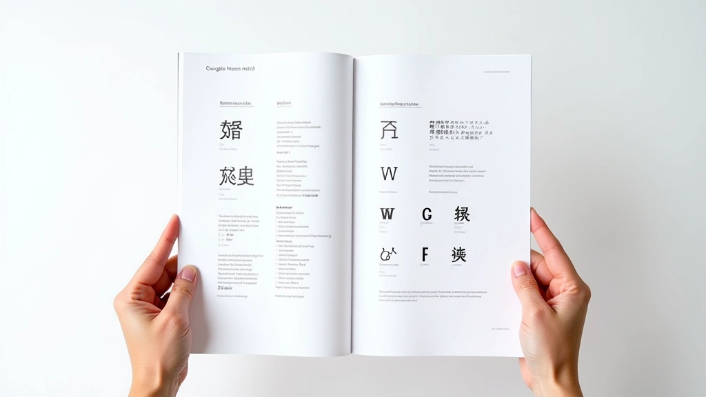
Font Pairing Strategy
Selecting typefaces that work together across English and Chinese. Weight matching, optical sizing, and visual balance. We cover serif-sans combinations, modern pairings, and traditional approaches. Understanding how different font families interact is the foundation of bilingual typography.
Spacing & Rhythm
Line height, letter spacing, and paragraph rhythm for mixed-language content. Specific measurements for Hong Kong’s high-density displays.
Typographic Hierarchy
Clear distinction between headings, body text, and captions. Creating visual order that guides readers through bilingual content naturally.
Web Font Implementation
Google Noto Sans and Serif for reliable Chinese character support. Web-safe fallback strategies. Performance optimization for loading multiple scripts. Testing on actual Hong Kong devices with high pixel density displays. Ensuring your typography looks sharp across all user environments.
Design Philosophy
Readability First
Every typographic choice serves one purpose: making text easier to read. We don’t chase trends. We focus on what actually works for your audience, especially on the small screens common in Hong Kong.
Cultural Balance
English and Chinese aren’t just different scripts — they’re different languages with different design traditions. Respecting both means creating harmony without forcing one aesthetic onto the other.
Technical Precision
Typography is measurable. We use specific line heights, letter spacing values, and font weights — not guesses. Data-driven decisions lead to better results.
Practical Knowledge
Everything we teach comes from real projects. You’ll learn what works, what doesn’t, and why — with specific numbers and examples you can use immediately.
The Typography Process
From analysis to implementation in four clear steps
Analyze Your Content
Understand the balance of English and Chinese text. Different ratios need different approaches.
Select Font Pairs
Choose complementary typefaces. Test weight matching and visual balance across scripts.
Set Measurements
Define line height, letter spacing, and hierarchy. Optimize for Hong Kong display densities.
Test & Refine
Verify readability across devices. Adjust based on real user feedback and testing.
What You’ll Master
Pairing Latin and CJK characters that actually harmonize visually and functionally
Setting precise line height and letter spacing values for mixed-language paragraphs
Building typographic hierarchy that works across two scripts simultaneously
Implementing Google Noto fonts and web-safe alternatives for reliability
Optimizing readability on high-density displays common in Hong Kong devices
Creating paragraph rhythm that flows naturally in both English and Chinese
Resources We Recommend
Tools and services for quality bilingual typography
Google Fonts
Noto Sans SC
Noto Serif SC
Adobe Fonts
Font Bureau
Monotype
Featured Learning Resources
Explore our most popular guides on bilingual typography


Dive Deeper
Access detailed guides and resources
Ready to Perfect Your Bilingual Typography?
Whether you’re redesigning an existing site or starting fresh, we’re here to help. Get personalized guidance on font selection, spacing, and hierarchy for your specific project.
Contact Us Today